On Thursday 29 June, Tom McGuinness held a session in collaboration with the Institute, on how to create effective infographics. Tom is a freelance Art Director/Designer based in New York, who works predominantly in News Media – with clients such as The Telegraph, NBC, Vice Media and Bloomberg. More recently he has been working in the field of data design.
Tom was the second speaker from the Institute’s Bursting Bubbles series of events. These ‘how to’ sessions began in March 2023 and are hosted in our Wellington office and over zoom. Each session has a different speaker and theme; the conversations are designed to expand our thinking and ideas post-COVID lockdowns. See more information on future Bursting Bubbles sessions.
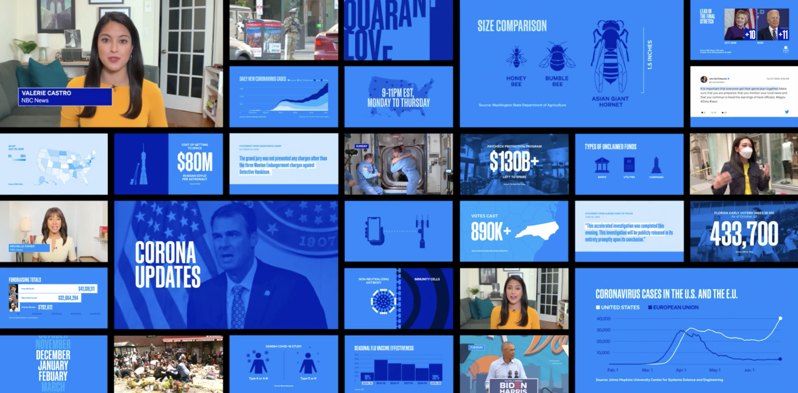
Tom presented his insights from creating infographics and working for large scale media corporations. The discussion covered how and why good design is important, with Tom sharing personal projects with relevance for both people working in the design space, and businesses using design to convey key ideas.
Tom’s focus for the session was on the utility and service of infographics, and the use of design to connect with the general public. He particularly enjoys how infographics are not necessarily involved in marketing or advertising, but instead focus on communicating real findings from the world. Infographics seek to provide honest and valuable insights, usually without a hidden agenda.
Tom got a start in London working for The Telegraph where he was an illustrator for their news articles. He found that since there was such a strict timeframe of publication, he had to quickly hone his skills to be concise and poignant. Although illustration is a different practice to infographic design, his learnings became invaluable for future projects. Tom has since exited the world of illustration, but he found satisfaction in the task of pulling apart editorial content and acting as median for the information and the public. His work is powerful at conveying complex information and statistics in a simple and engaging way.
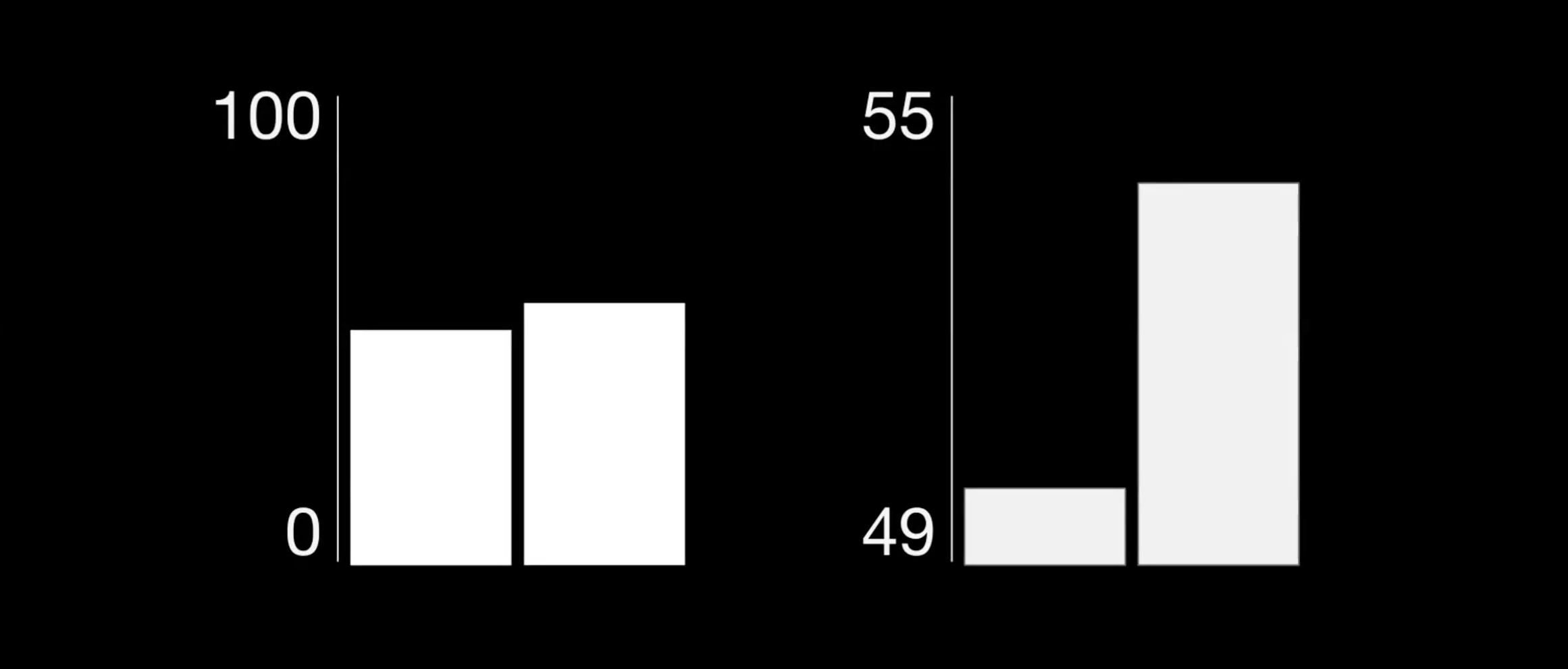
Interestingly, Tom shared an example of how design plays a vital role in the way information is communicated. Both graphs (see image on the right) are factually correct, but they tell two completely different stories.
Scale has been used to show a large difference between the bar values on the right, and a small difference between the bar values on the left, illustrating how different an infographic can look even if the numbers used are the same.
In Tom’s experience, working with graphs over the COVID-19 pandemic, he felt that slight changes like this have the power to change how a viewer will understand and emotionally react to a news story. As there are no regulations for presenting information like this, it is up to the integrity and editorial ethics of the organisation to create a graphic that is true.

“You can make a mountain out of anything.”
Tom’s event finished with a Q&A session from the audience. Questions asked varied from discussions around the rise of artificial intelligence, to whether there is merit in developing your own personal style of infographics.
When you’re starting out with an infographic job, what’s your starting point and thought process with how to represent it and begin?
Read the given source material from the editor or journalist and get this thought process percolating. It is a conversation between you and them to figure out what the most important bit is to bring out of it. Grab certain numbers that are interesting to the story and draft out what kind of graphic and tone fits best. It is a long process, and you go through a number of iterations.
Have you found that the use of visual/conceptual analogies works towards helping transcend and make data more accessible?
Visual analogy is a key word here. It’s innate in everyone to want to visually see the information in front of them, and it legitimises what they’re hearing (in context of watching the news and being presented with an infographic illustrating the data).
What does visual analogy mean?
A visual metaphor. A portrayal of an idea with artistic privileges.
How do you find the right balance of objectivity where the goal of the visualisation is toward advocacy or toward being convincing?
It goes down to a company’s ethics really. There is nothing apart from design fundamentals to guide the process of infographic design. Like we discussed previously, there are no protocols or guidelines regulating this. You’re trying to remain neutral, and you learn pretty quickly that colour choices and shape can really change a story, and that’s why you’re there, as a designer, to not let those things affect it too much.
Tom’s key take aways:
- Infographic design is a spectrum
- Find the balance between being precise but also engaging
- Choose the right style and tone for the type of information
- Be as concise, stripped down and simple as possible with the visual presentation of information
The Institute is very grateful both for Tom taking the time to share his insights (especially waking up at 1am New York time to zoom in), and for those who joined us for this conversation.
Visit Tom’s website.
We are looking forward to the next Bursting Bubbles event, how to be non-partisan in a partisan world with James Picker, which will be from 5-6pm on Thursday 27 July. Register to join us in person at our Wellington office or over zoom.


